
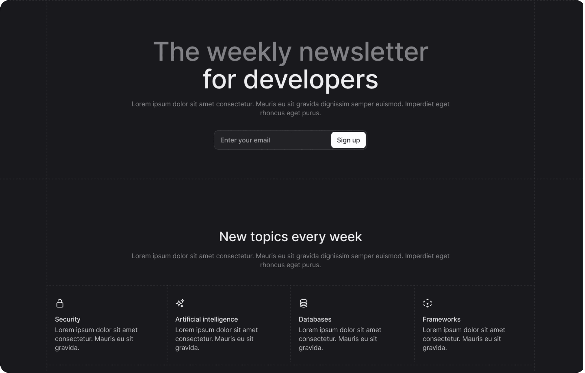
LeadCatch
A streamlined tool for capturing and managing newsletter leads with easy export options and conversion tracking.
We use four system colors in Pink Design — red, orange, green, and blue. Each of these colors represents a state in the Appwrite console — red indicates an error or danger, orange indicates a warning, green indicates success, and blue indicates information. Knowing the difficulties our users might face while seeing these colors, we don’t rely on color to make critical information understandable.
People with fine motor control restrictions or disabled hands or arms will be unable to use a mouse. In Pink Design, we provide distinct states for interactive elements. By designing states like focus, hover, and active, we provide the ability to navigate all interactive elements with a keyboard. This is not only an accessible experience but also a better experience for all users who prefer keyboard navigation, including Appwrite’s developer community.
It is possible to enhance accessibility through development as well. In collaboration with our engineering team, we decided to incorporate the following into Pink Design:
This is a title

Browsers have a default font size that users can change via the browser setting. A pixel is an absolute unit for fixed sizes and spaces that ignores browser settings. This means that if we are using pixels and a user (with or without vision impairment) changes the font size in their browser settings, their setting won’t affect our product. That being said, pixels should not cause any problems if the user zooms in, but we make no assumptions about users’ preferences. This is why we decided to define the font size in REM, which is a relative unit.
Explore more projects
A streamlined tool for capturing and managing newsletter leads with easy export options and conversion tracking.
A streamlined tool for capturing and managing newsletter leads with easy export options and conversion tracking.
A streamlined tool for capturing and managing newsletter leads with easy export options and conversion tracking.